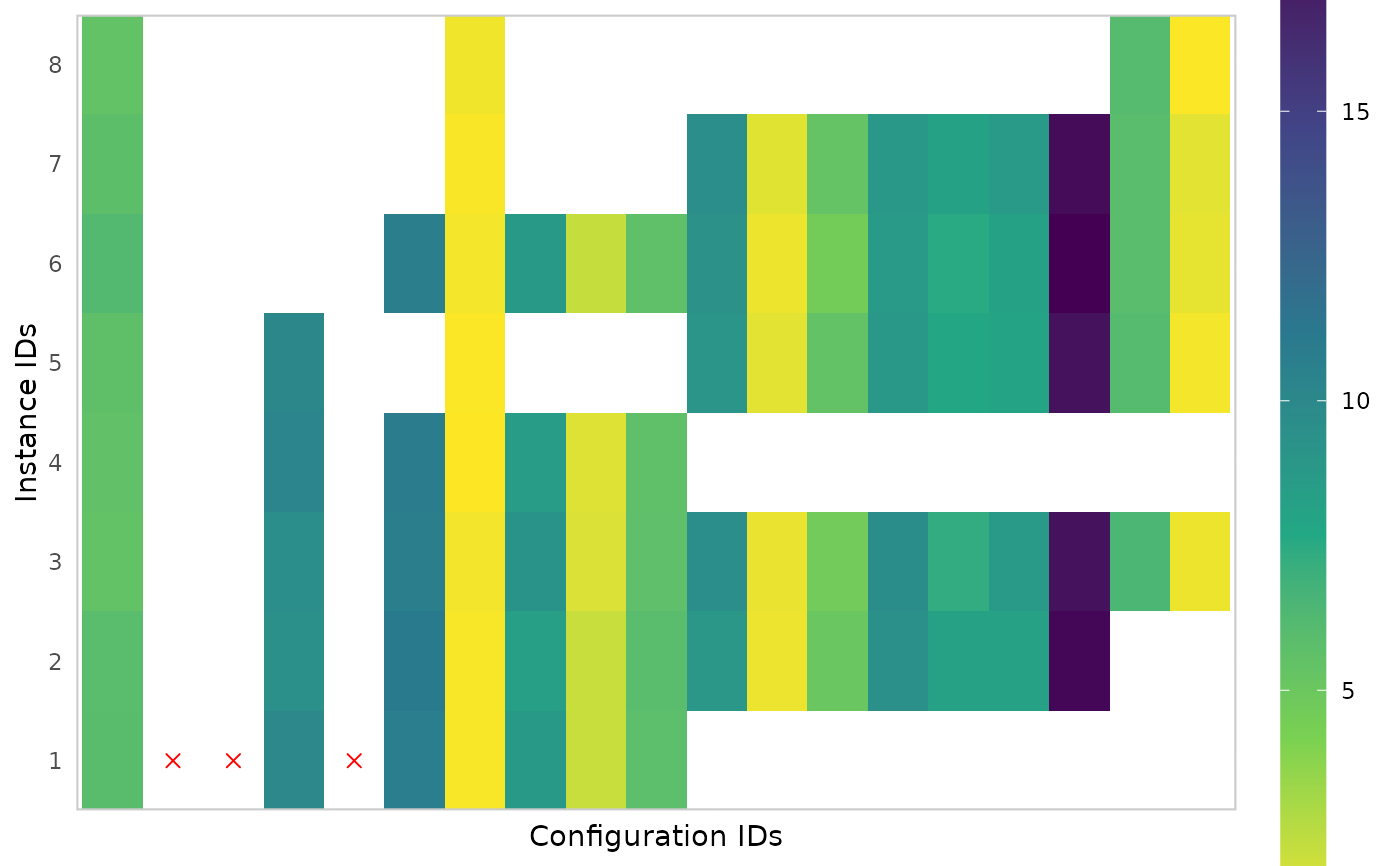
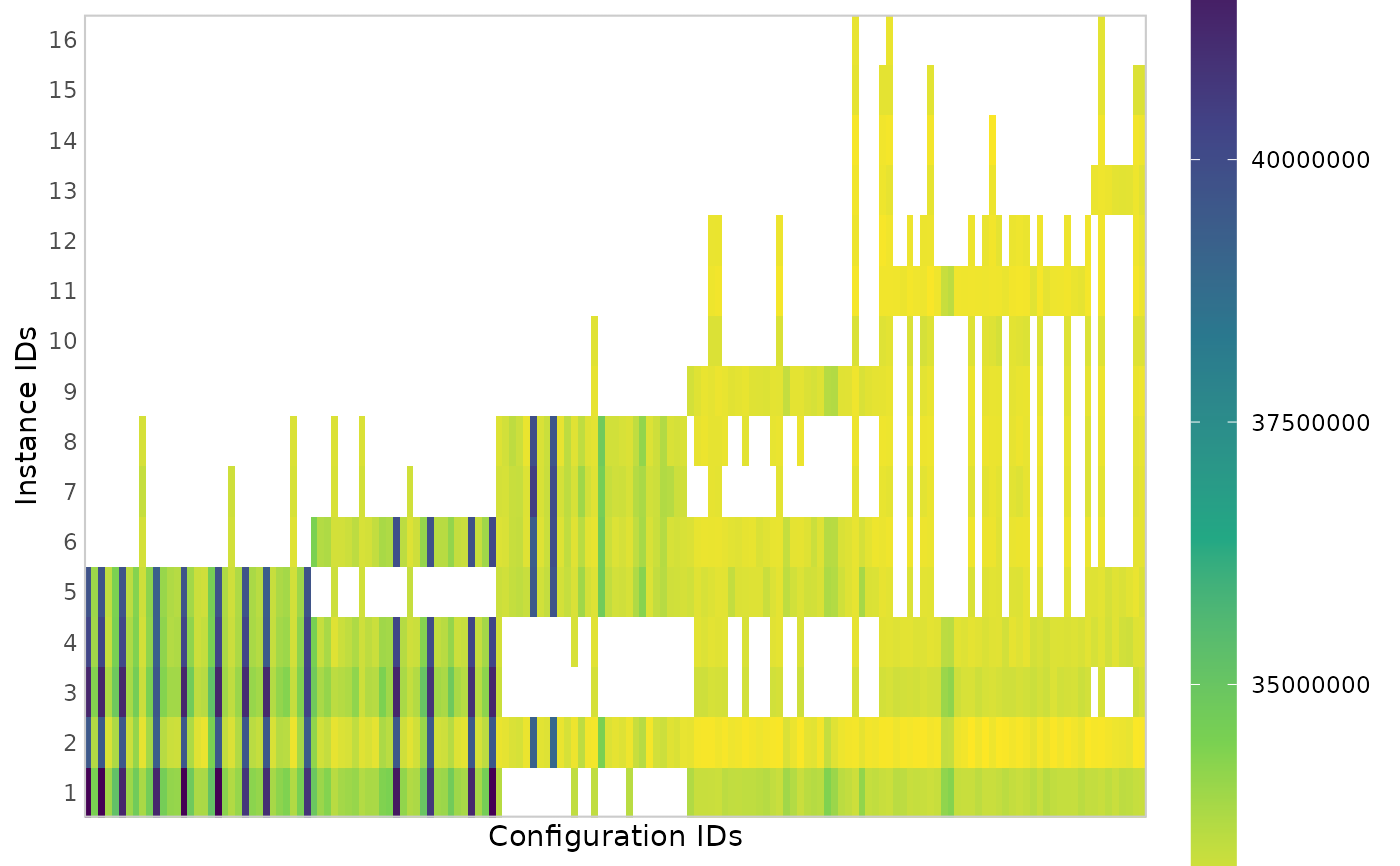
Creates a heatmap plot that shows all performance data seen by irace.
Configurations are shown in the x-axis in the order in which they are
created in the configuration process. Instances are shown in the y-axis in
the order in which they where seen during the configuration run. This plot
gives a general idea of the configuration process progression, the number of
evaluations of each configuration show how long they survived in the
iterated racing procedure. Rejected configurations are shown with a red X.
plot_experiments_matrix(
  experiments,
  filename = NULL,
  metric = c("raw", "rpd", "rank"),
  show_conf_ids = FALSE,
  interactive = base::interactive()
)
Arguments
- experiments
matrix()
Experiment matrix obtained from irace training or testing data. Configurations in columns and instances in rows. As in irace, column names (configurations IDs) should be characters.- filename
(
character(1)) File name to save the plot, for example"~/path/example/filename.png".- metric
Cost metric shown in the plot:
"raw"shows the raw values,"rpd"shows relative percentage deviation per instance and"rank"shows rank per instance.- show_conf_ids
(
logical(1))
IfTRUE, it shows the configuration IDs in the x-axis. The defaultNA, only shows them if there are no more than 25.- interactive
(
logical(1)) TRUE if the report may use interactive features (usingplotly::ggplotly(),plotly::plot_ly()andDT::renderDataTable()) or FALSE if such features must be disabled. Defaults to the value returned byinteractive(),
Value
ggplot2::ggplot() object
Note
Alternatively, experiments could be the data generated when loading the
.Rdata file created by irace (or the filename of that file), from which
the experiments matrix will be loaded.
Examples
iraceResults <- read_logfile(system.file(package="irace", "exdata",
                                         "irace-acotsp.Rdata", mustWork = TRUE))
plot_experiments_matrix(iraceResults)


plot_experiments_matrix(read_logfile(system.file(package="iraceplot", "exdata",
                                         "dummy-reject.Rdata", mustWork = TRUE)))
plot_experiments_matrix(read_logfile(system.file(package="iraceplot", "exdata",
"dummy-reject.Rdata", mustWork = TRUE)))